A pixel display face
MIDPOINT MUJAM
A typeface that lives between two scripts. Midpoint Mujam draws Latin and Arabic letterforms into a single shared alphabet — bridging two scripts through form, finding connection where difference is usually assumed.
§03 — Process
Two scripts, printed on top of each other
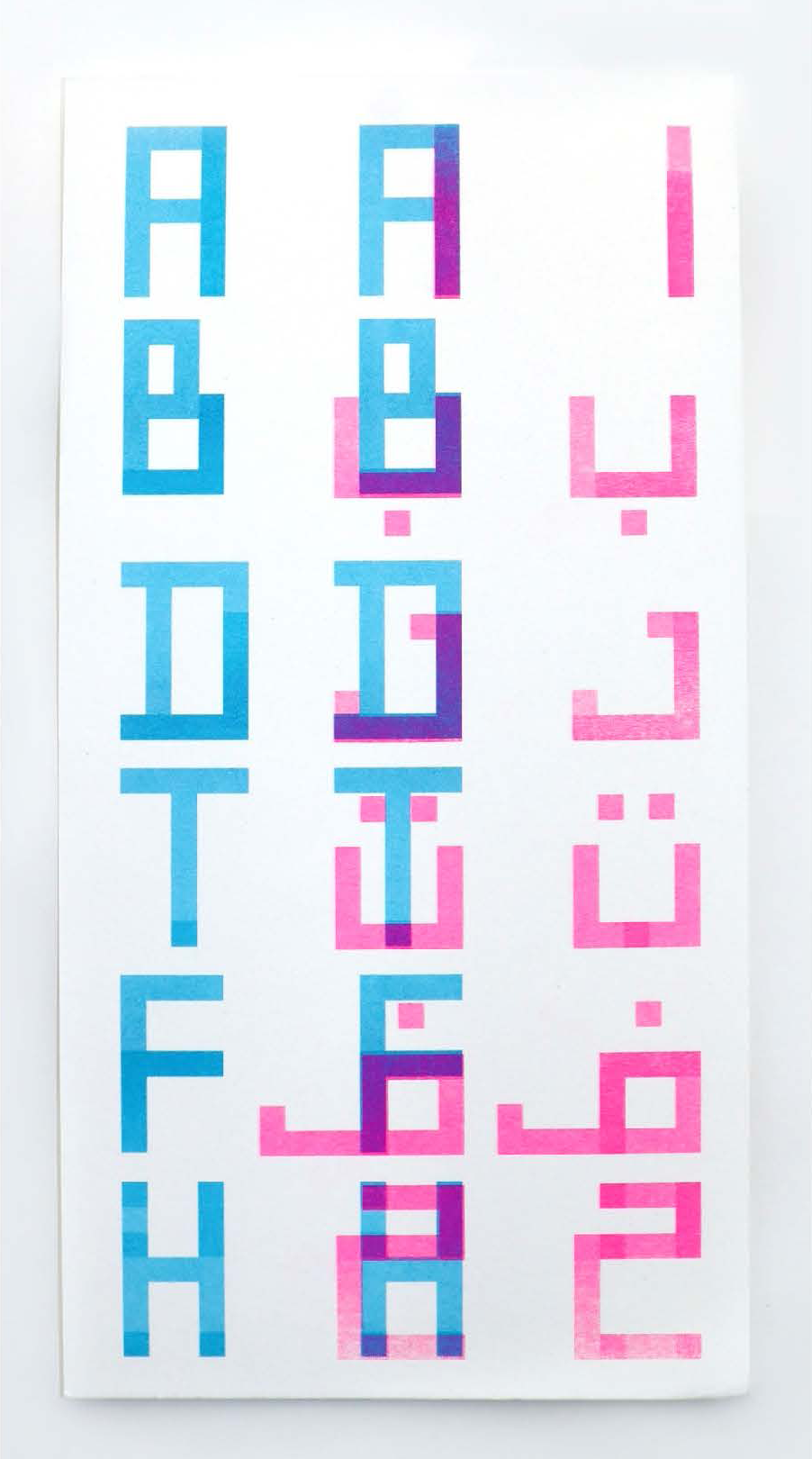
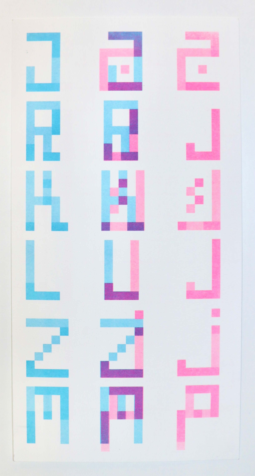
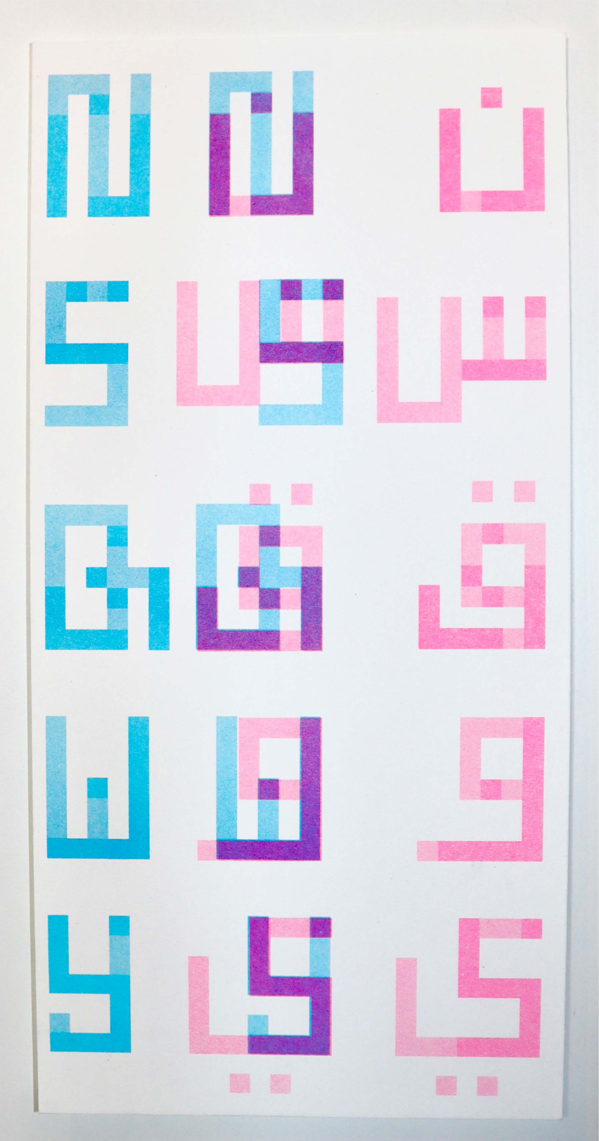
Riso proofs from the Mujam build. Cyan = Latin. Pink = Arabic. The overprint where they meet is Midpoint.
 01 / 04
Sheet 01 / Latin · Hybrid · Arabic
A–H. Cyan English on the left, pink Arabic on the right, the impure midpoint overprinted between them.
 02 / 04
Sheet 02 / J → M
Rotating glyphs to align with Arabic skewed too far. The final forms balance both scripts equally.
 03 / 04
Sheet 03 / N → Y
Square Kufic geometry meets capitalised handwriting. Pink and cyan layers overlap into a third colour.
 04 / 04
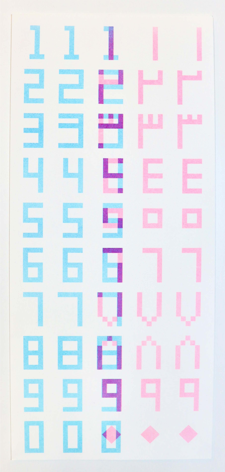
Sheet 04 / Numerals 0–9
Numbers carry the transliteration logic — 2 and 3 already stand in for Arabic letters online.
§03 — Live type tester
Take it for a spin
uppercase + numbers only
Color
Background
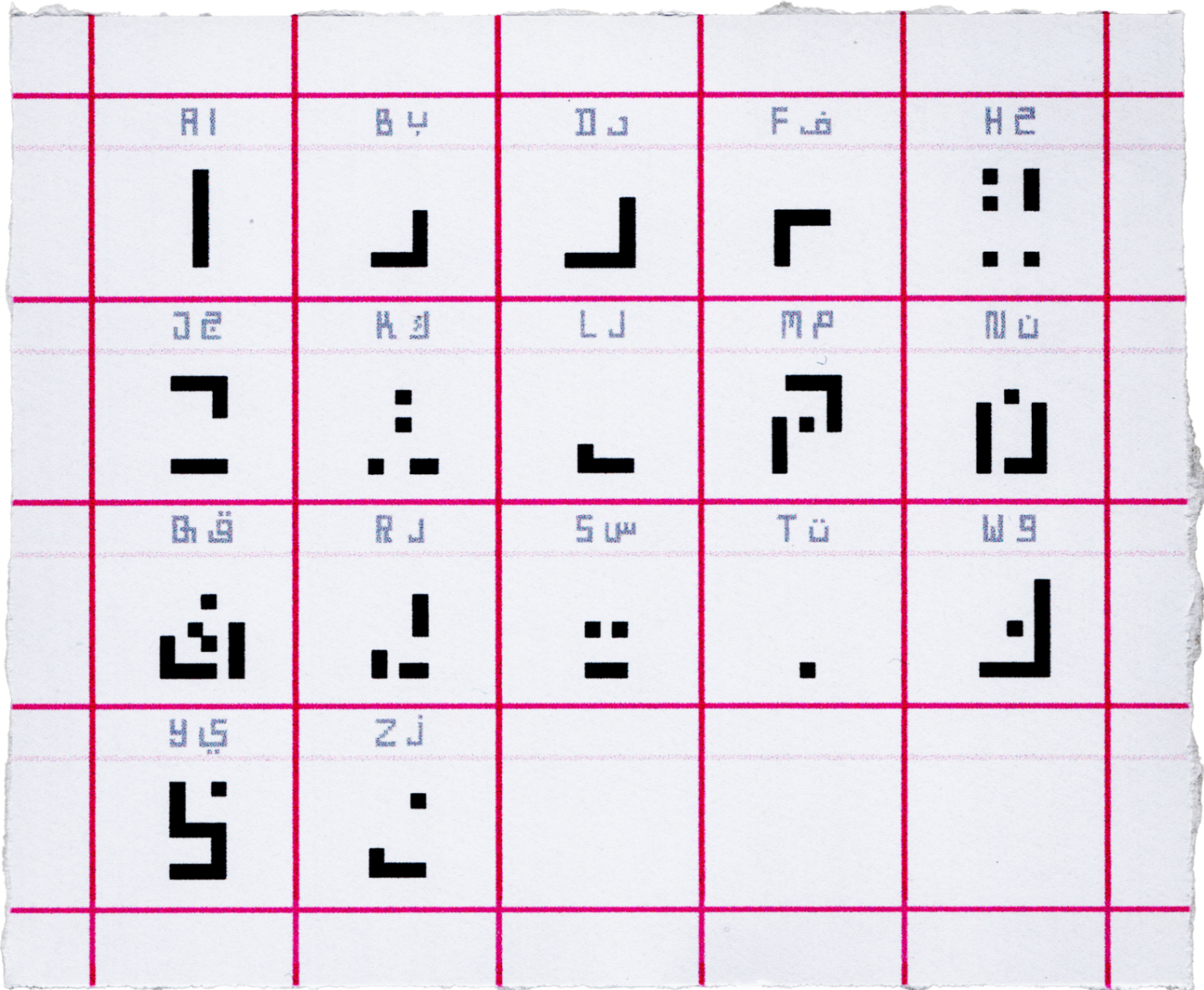
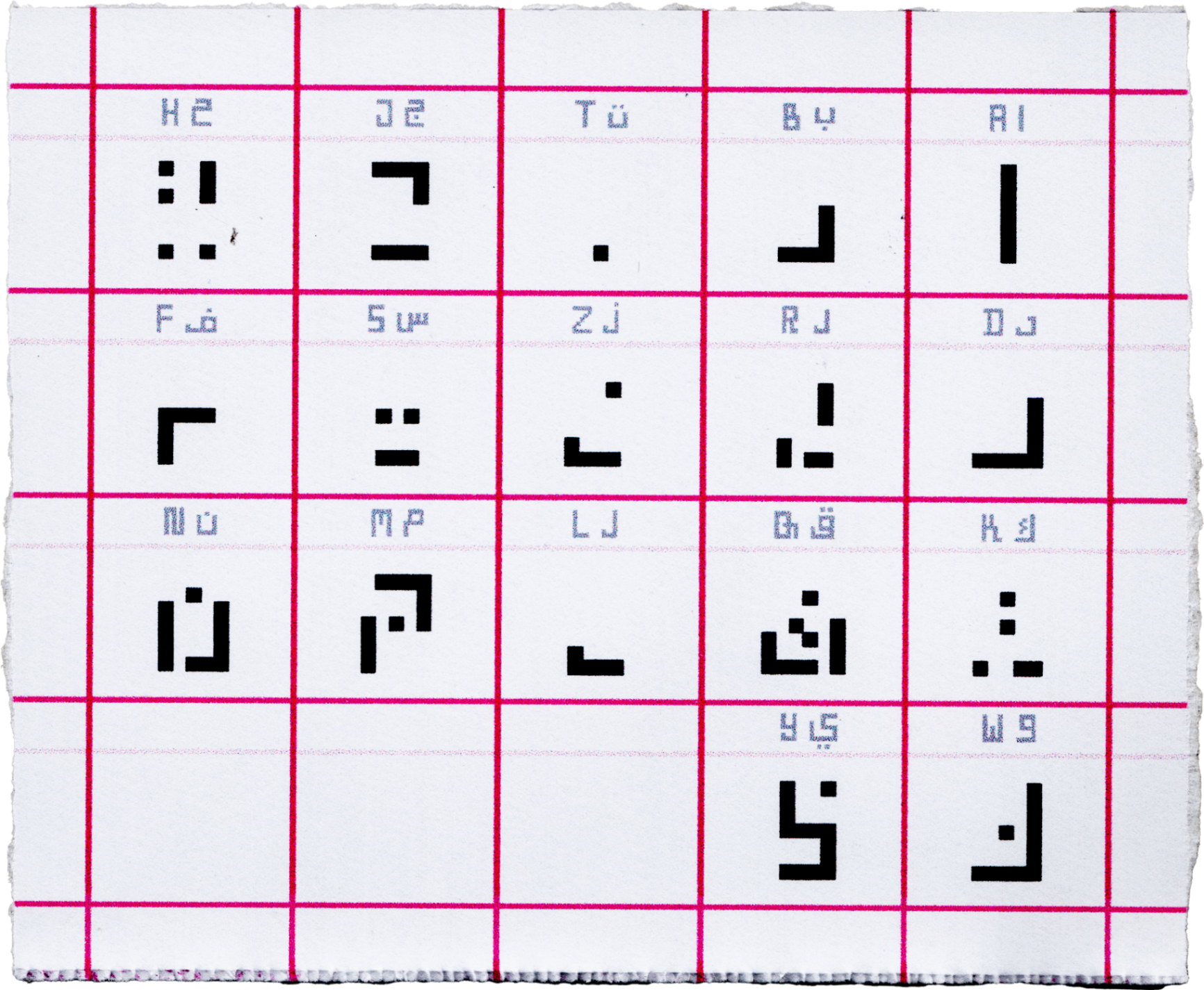
§04 — Glyph map
Every character, one click away
Arabic & English study sheets
§06 — About the font
Why "Midpoint Mujam"?
✶ a few notes from the studio
· Note 01 — Origin
Originally titled Qwerty 101 — named after the Qwerty and Arabic 101 keyboards — Midpoint Mujam explores the hypothetical evolution of script if English and Arabic had shared closer roots. It was inspired by Luigi Serafini's Codex Seraphinianus, which evokes the feeling of encountering an entirely unfamiliar alphabet, and by the transliteration of Arabic on social media, where numbers like 2 and 3 stand in for Arabic letters — reshaping the relationship between text and symbol.
· Note 02 — Thesis
A visual midpoint between two scripts. Neither bending more than the other.
· Note 03 — Process
Early experiments rotated English letters to align with Arabic forms, but the result skewed too far toward one script. The final characters were arrived at by balancing both equally. Some letters were omitted where no direct equivalent exists — such as c in English and ع in Arabic.
· Note 04 — Form
The square style draws from my own capitalised handwriting and the square Kufic tradition of the Hurufiya art movement in the MENA region. Colour was chosen for boldness and contrast in the overlapping forms. The series also considers direction — one piece reads right to left following Arabic convention, the other left to right.
· Note 05 — Name
Mujam.
Meaning "impure alphabet" — reflecting its hybrid nature, belonging fully to neither script. Built in Fontstruct as two versions, one per language, each correct in its own directional typing while remaining mutually intelligible.
· Note 06 — Why it matters
Both speaker communities on equal footing with a script that is genuinely new to everyone — where decoding becomes a shared experience, and a means of building understanding between two linguistic worlds.